Our Brand
YourSix has built a strong, recognizable brand rooted in trust, clarity, and confidence, and protecting that brand is a shared responsibility. This page is your source for official brand assets, guidelines, and clear do’s and don’ts to ensure everything we create looks, sounds, and feels unmistakably YourSix. If you have questions or need guidance beyond what’s outlined here, contact us at [email protected].
Using Our Assets
Alignment
Our preferred alignment of the logo is in its horizontal state. Use the Vertical version only when necessary.
Clear Space
Please provide sufficient clear space around the logo whenever it is in use.
Color Usage
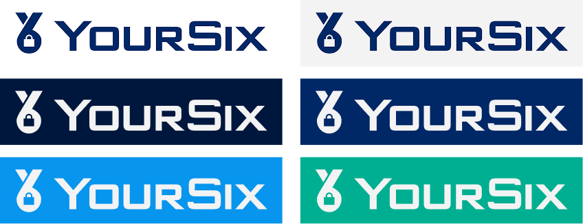
The full-color logos should be used on white primarily; however, lightly colored backgrounds are acceptable.
The one-color logo should be used only on color backgrounds within the YourSix color palette.
Typography
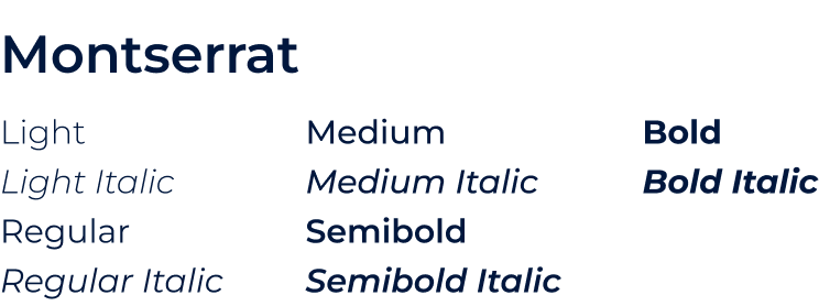
Montserrat is our brand typeface. It is to be used for every medium and use case, from headlines to body copy.
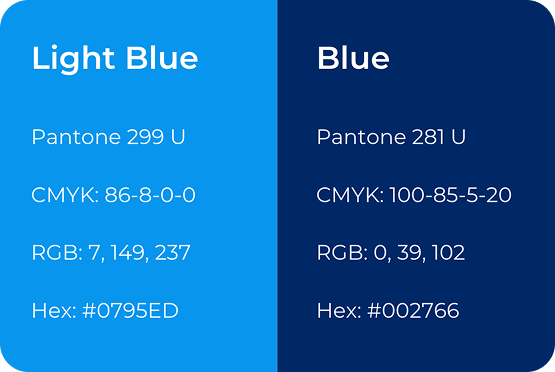
Primary Colors
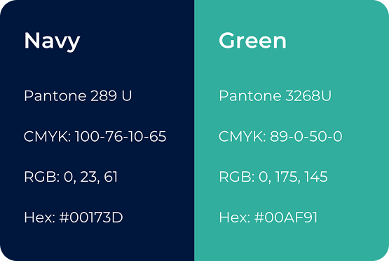
Use these colors in any layout or design. Dark blue and off white are to be used primarily in a digital environment, with green as an accent color.
Secondary Colors
Use these colors in any layout or design in addition to the primary colors. Do not use these alone without the primary colors. Secondary colors should not be more visually present than the primary colors.
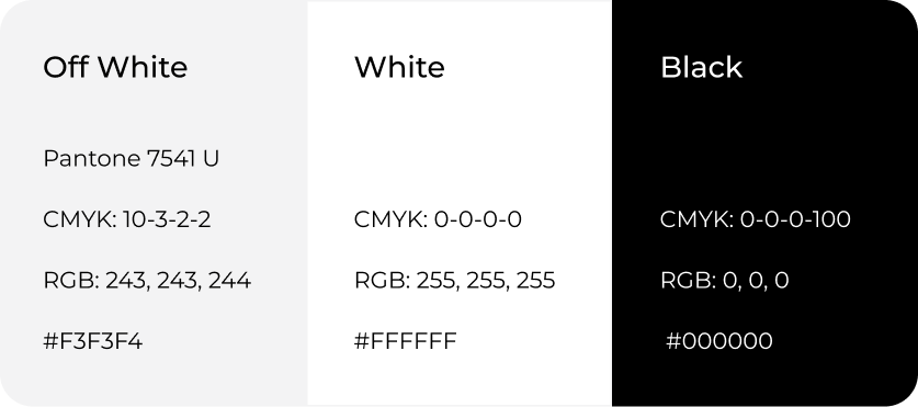
Support Colors
Regular white should be used for print in place of off white. Black should primarily be used for text on light colored backgrounds and in situations where only black and white are available.